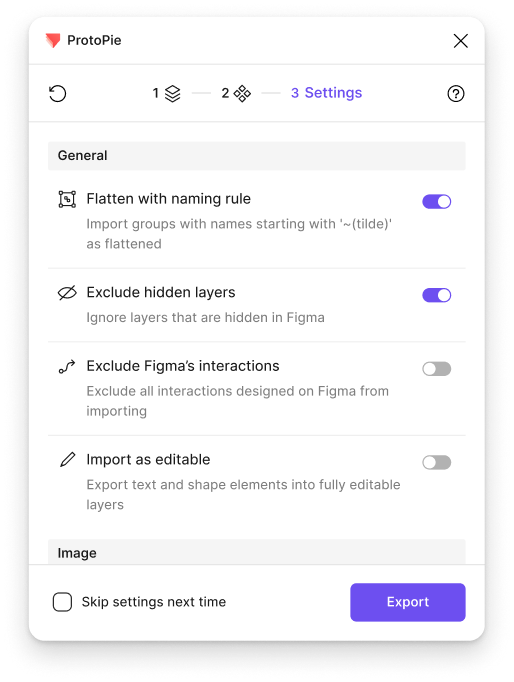
Figma to ProtoPie Plugin
Boosting efficiency by revamping the importing experience for more than 100K/month users
Company
ProtoPie
Timeline
2024.12 - 2025.03
Role
User testing, UI/UX design
Team
Product Designer (2), PM (1), Engineers (10+)
Impact
The previous Figma plugin for ProtoPie was straightforward but didn't keep pace with designers' evolving workflows.
After the redesign, the rate of repeated import attempts dropped—with the largest improvements seen among multiple retries.
First import
Re-import#1 ↓7%
Re-import#2 ↓12%
Re-import#3 ↓19%
Re-import#4 ↓25%


Re-import count per session:Before improvement (gray)vs. After improvement (purple)
Context
During enterprise user interviews about the experience of transitioning from Figma to ProtoPie, we discovered that many customers had created their own internal manuals for pre-processing before using the plugin.
This led me to hypothesize that for organizations or individuals without such manuals, internal champions, or accumulated know-hows, the import process would be a significant barrier to product adoption.
"We documented the process of transitioning from Figma to ProtoPie to make it easier for designers to understand and follow."
"It’s not easy to all designers, many users aren’t aware of how to optimize their Figma layer and component structure for ProtoPie."
Quotes from customer interviews
Problem
Since Figma and ProtoPie differ in purpose and output, there are differences in layer structure, interaction authoring methods, and more. As a result, users without enough experience often had to repeat re-imports multiple times to achieve the desired result—this is precisely the context in which our enterprise customers created their internal manuals.
Considering that over 90% of all users begin their product journey by importing designs from Figma, we believed this issue was acting as a strong barrier to user conversion at the very start of the flow.


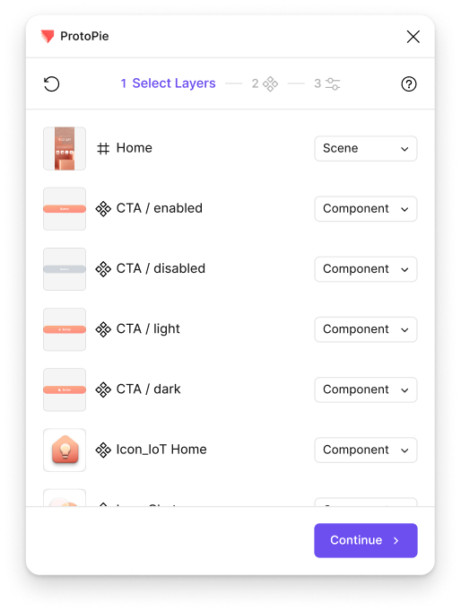
Example 1. Top-level frames imported as Scenes, deeper level frames imported as Objects
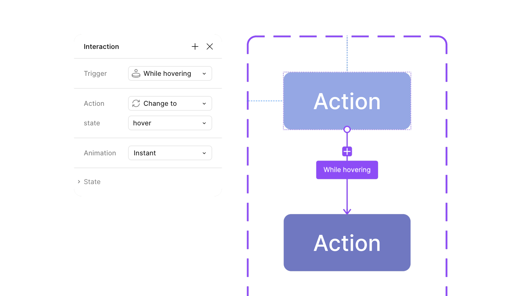


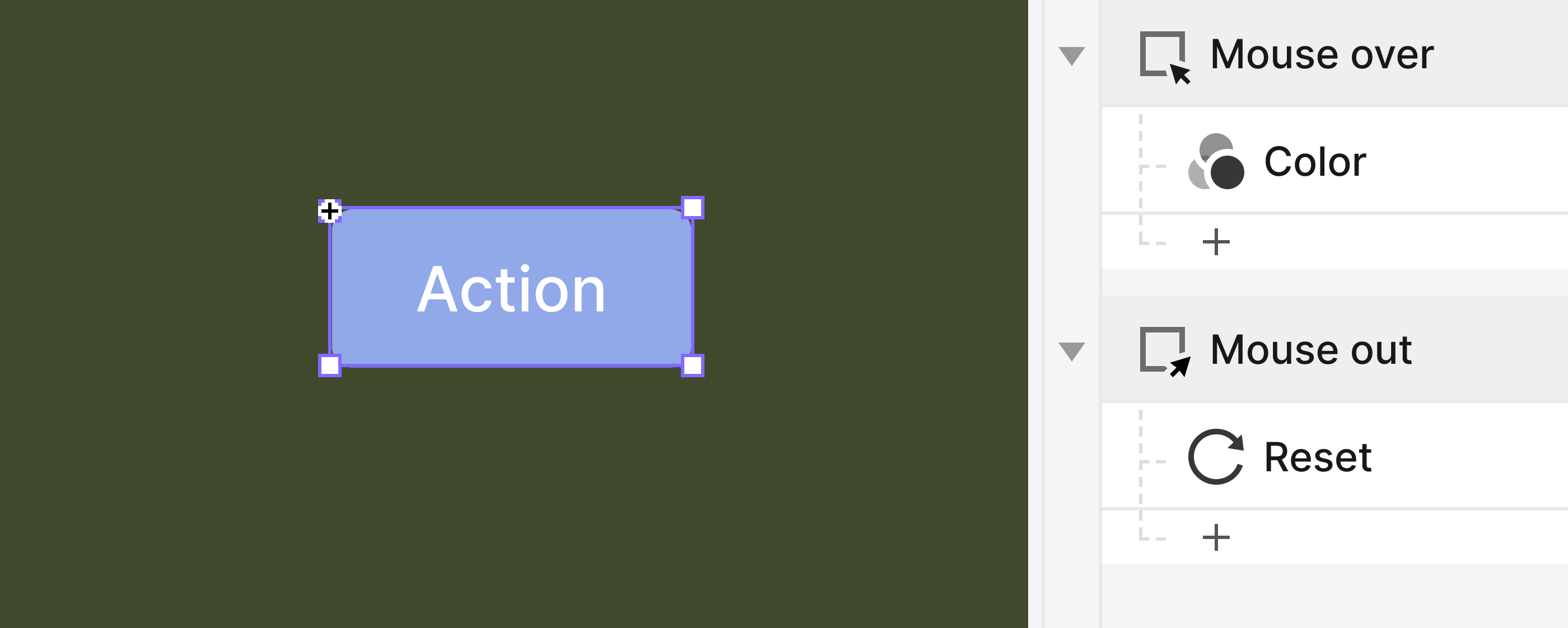

Example 2. Different approaches with creating interactions in Figma vs ProtoPie
Solution 1
I had a hypothesis that offering multiple options to replace pre-processing would reduce the number of re-imports. I designed new options based on the manuals and interviews, and divided the process into steps to prevent cognitive overload.
However, in user testing, most users were confused, and some expressed resistance to options that arbitrarily altered the layer structure.
As-is
RunPlugin

Select layer(s)
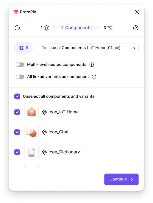
Export as objects
Recreate intraction
Create Component

To-be


RunPlugin

Export as components

New Response: State

User Testing
We conducted user testing with two options: Option A, which offered the newly designed options through a step-by-step UI to prevent cognitive overload, and Option B, which dynamically reflected canvas selection similar to the existing approach.
We discovered that in ProtoPie's mental model, interactions are defined at the layer structure level—meaning users need to retain control over the layer structure. What was unmet in the existing product wasn't the need for more options, but rather transparent communication with users about what the system is doing, or will do.
Format
Moderated remote sessions(Maze + Figma)
Participants
2 Product Designers, 4 Prototypers
Duration
60min


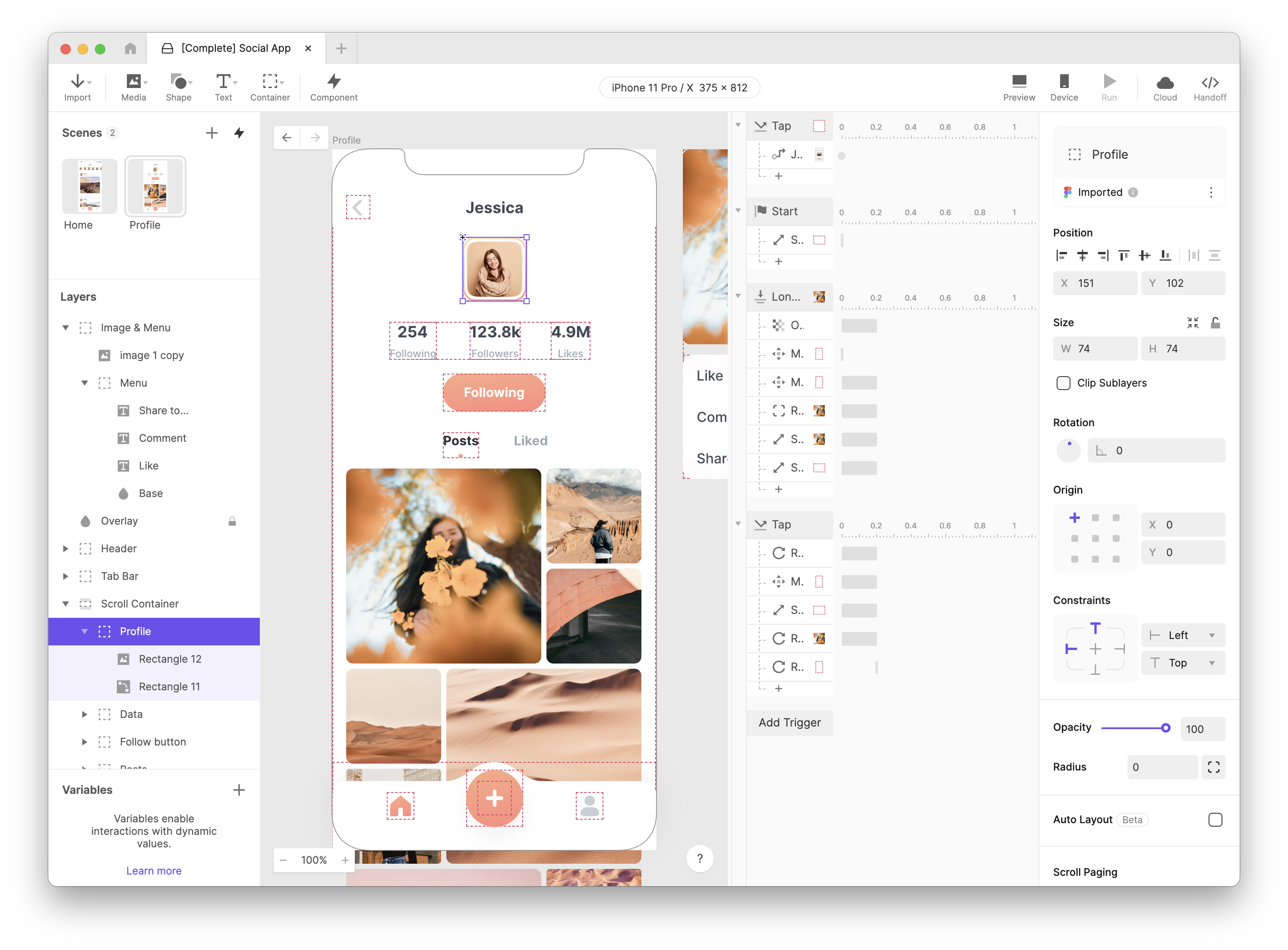
Untitled


Untitled

Personal
File
Assets

Pages

Page 1
Page 2
Layers

CTA
Icon

Home
A

Share
Design
Prototype
100%

Frame


Position


X
4518
X
-1569


0°


Auto layout


W
Fit
H
Fit


0


0

0

Clip Contents
Appearance


100%
⌞
0

Fill

Stroke
Effects
Selection colors
Layout grid
Plugin


ProtoPie

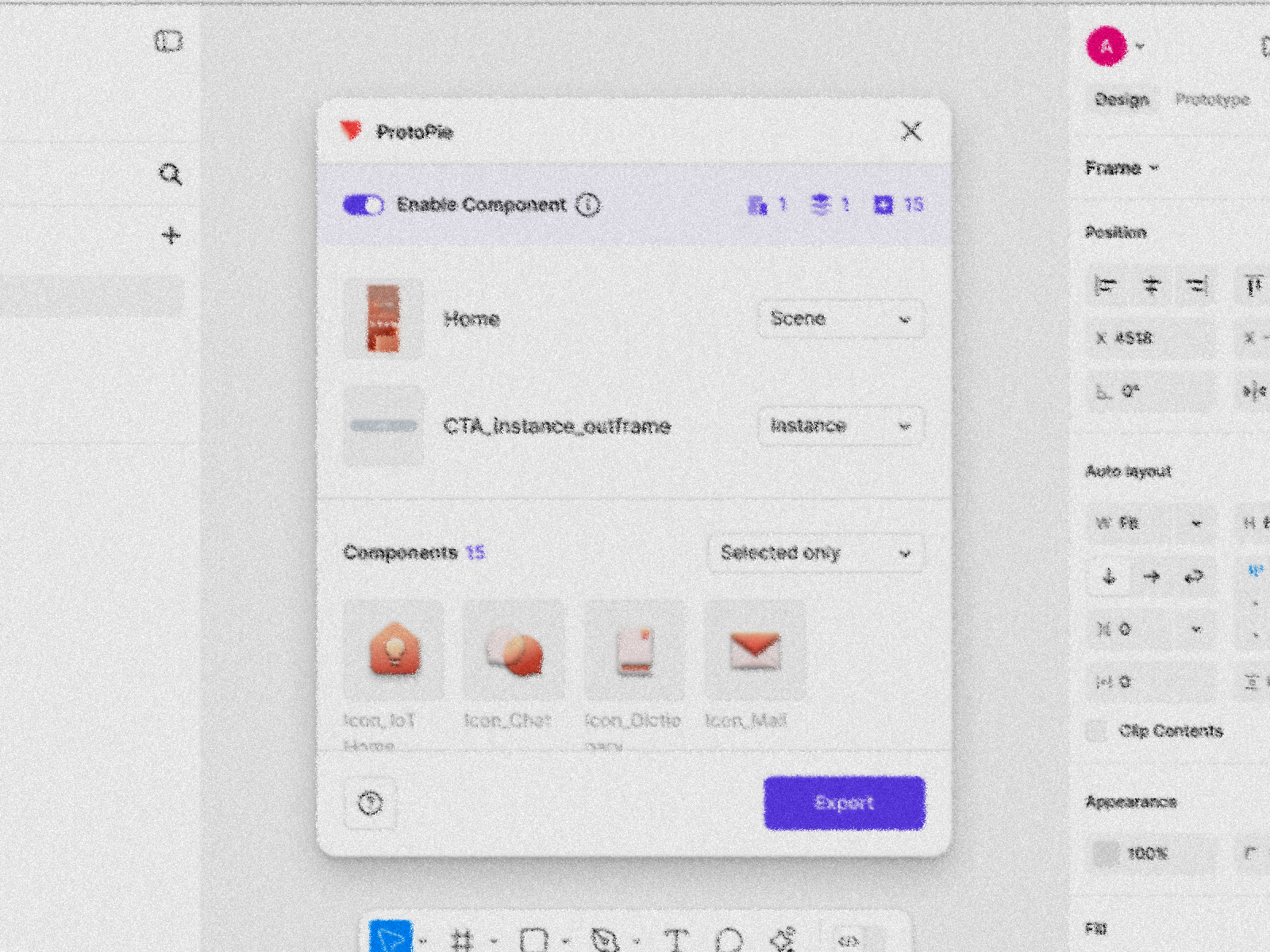
Enable Component

1
1
15
Home
Scene


CTA_instance_outframe
Instance
Components
15
Selected only

Icon_IoT Home

Icon_Chat

Icon_Dictionary

Icon_Mail
CTA

State=On

State=Default
State=Off
State=Disabled
Icon_misc
State=asleep
State=light
State=search
State=light
State=light
State=light
Icon_IoT Home
Export

Key Findings
Findings
Insight
Users primarily import selectively rather than in bulk.
In this process, "what's currently selected" is the most critical piece of information.
Regardless of options provided, some post-import processing is unavoidable.
Users have little motivation to learn complex options and terminology just to customize.
Design Changes
Change
Why
Unified View
Prioritized interaction with the canvas instead of introducing intermediate steps, improving intuitiveness
"Component Mode" on and off as a toggle switch
Reduced the number of items users need to select; concise on/off explanations
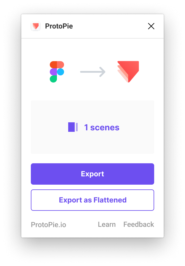
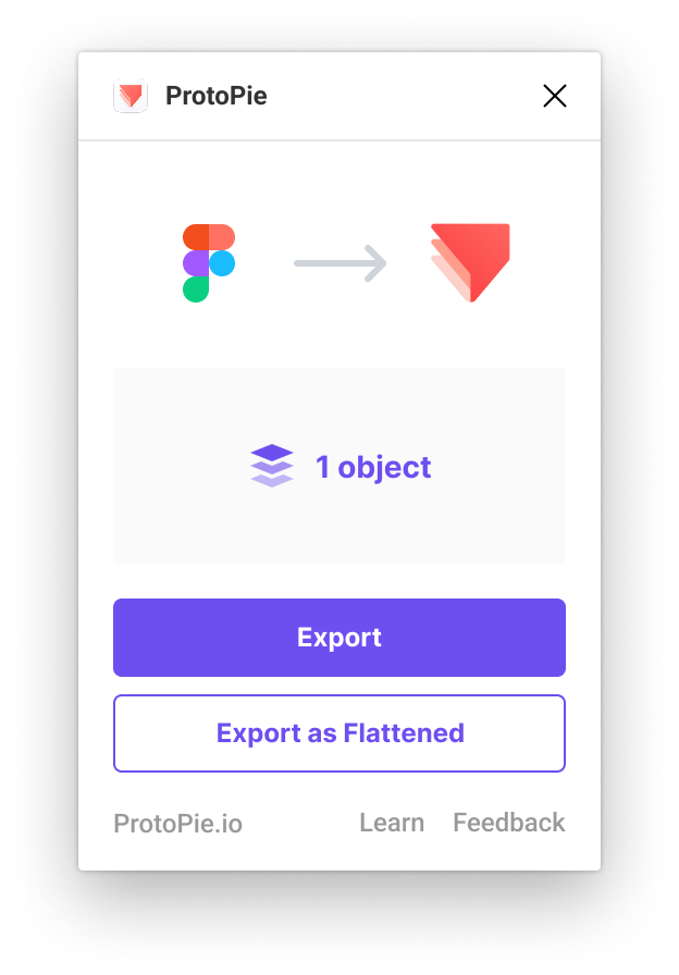
Clear Output Categories
Communicated in terms of expected results in ProtoPie after import (Scene, Object, Instance, Flattened)
Output
Hands-on simulation of four use cases showed time-on-task reductions between 10% and 60%, depending on the scenario.
One of the cases: Hover effect using Opacity, Scale

Reflection
Guided flows don't always reduce friction. I learned that experienced users often prefer speed and control over excessive guidance.
Respect existing mental models rather than introducing new ones. When the task is to improve an existing design, path dependency has already formed. I realized that when introducing a new mental model, it must be carefully evaluated through user testing from an early stage.